

A Very Pantone 2019 Party
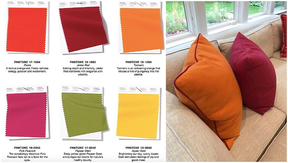
Out with the old and in with the new. When it comes to design, we’re already looking ahead into 2019. At the beginning of each year, the color connoisseurs at Pantone identify the official “Color of the Year,” which helps guide design trends in industries ranging from decor and design to food and fashion. To help predict next year’s hue, Pantone attends September’s New York Fashion Week Spring/Summer 2019 and creates its “Color Trend Report,” a guide to emerging color stories as seen in fashion. This year’s report features bright red-oranges and bold pinks. We recently designed and catered an at-home milestone birthday party featuring exactly that spirited scheme of shades! Here’s how we interpreted the Pantone 2019 color trend ideas.

The Inspiration
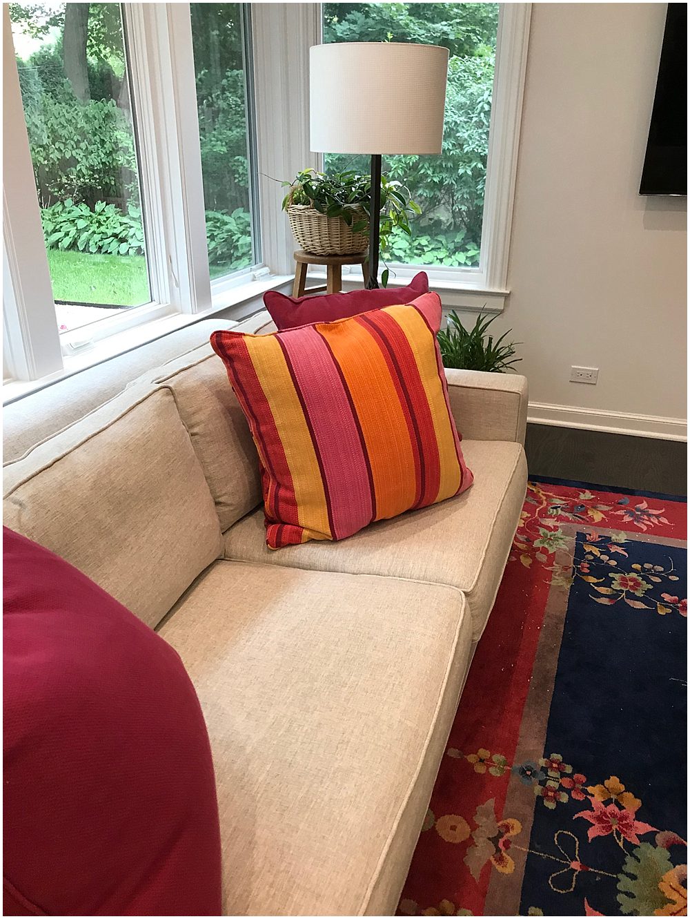
When our in-house designer Kenneth Woodman met with the birthday client in her home, he was enthralled by her bold throw pillows—which just so happened to be in pink and orange shades nearly identical to those featured in the Pantone trend report.
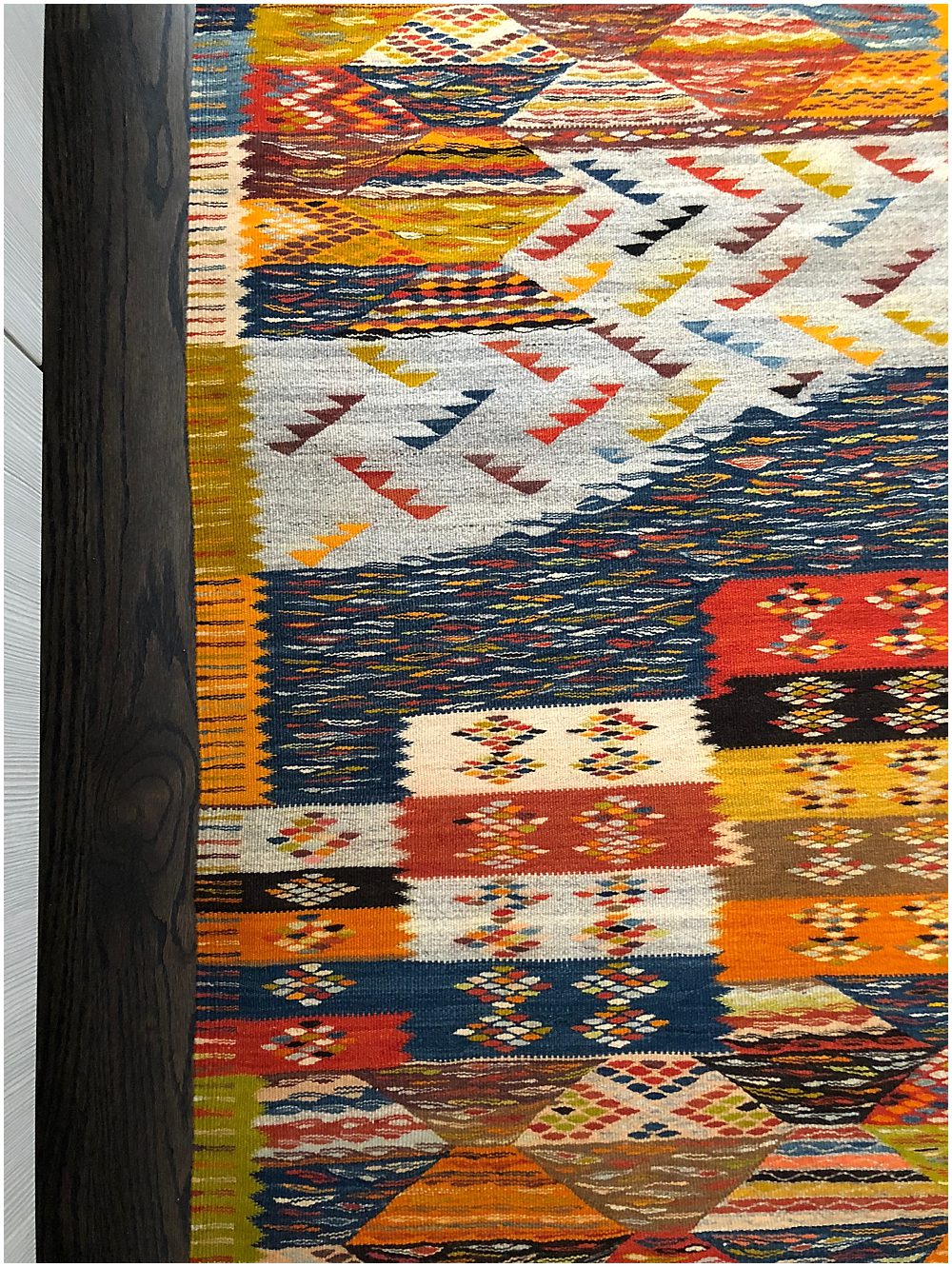
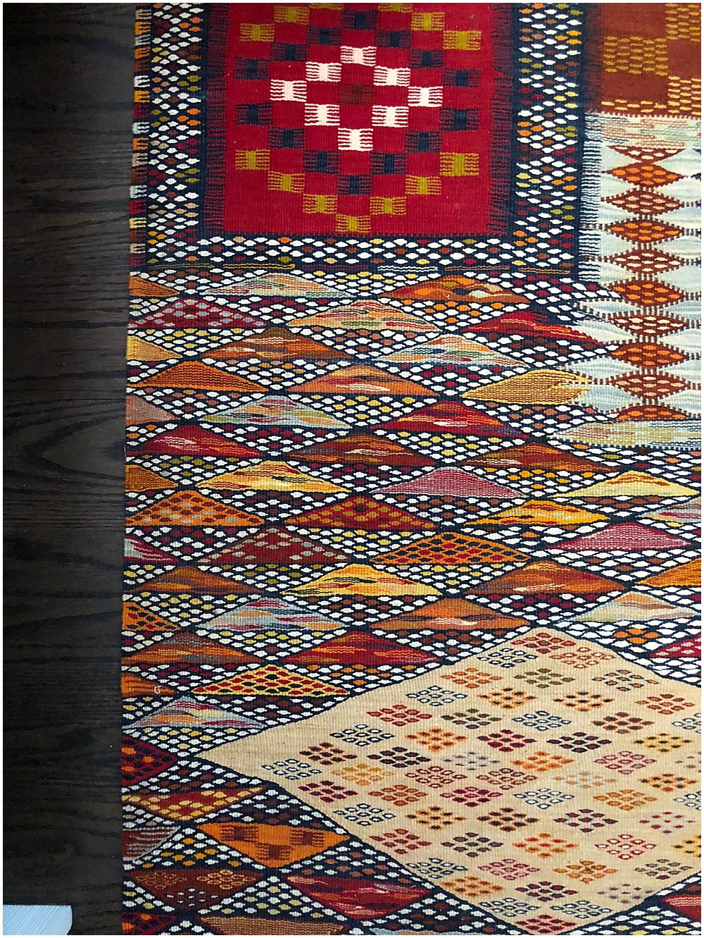
An ardent traveler and collector of global decor, our client was inspired by the colors of Morocco and found the vivid hues to be the perfect complement to her patterned textiles from around the world. She and Kenny decided that a pink and orange theme would add the right amount of spunk to the birthday decor, as well as pay homage to the client’s travel passions.
Florals
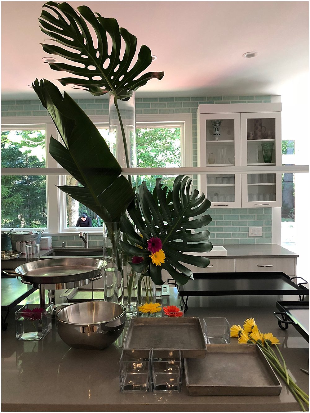
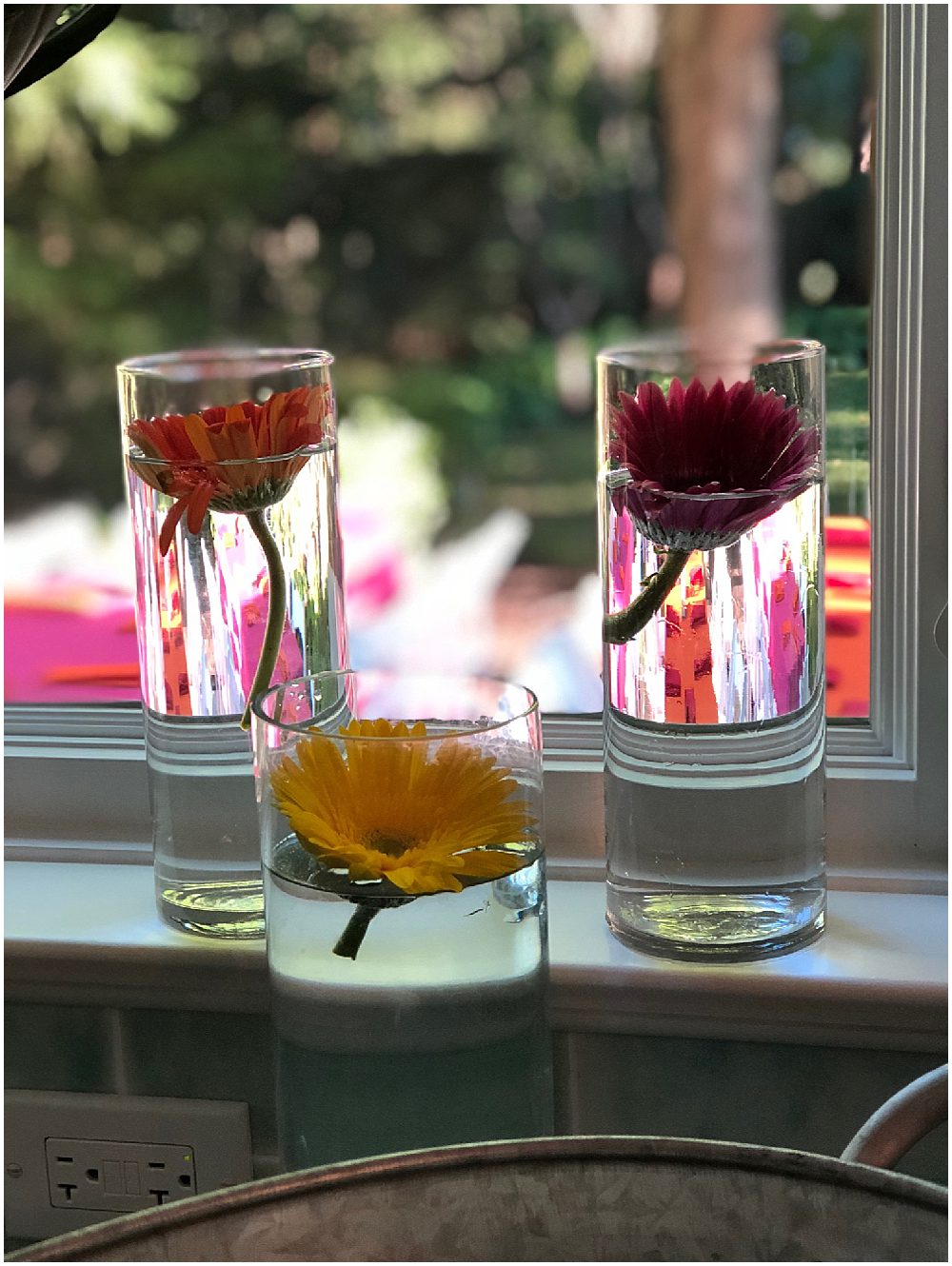
We usually like to use flowers all over the event space, subtly extending the decor theme into every nook and cranny. Because this party was all about color, we knew we needed statement flowers. Kenny picked up a few bouquets of gerbera daisies, a variety known for its vibrant colors, in pink, yellow and orange from Kennicott Chicago, our local wholesale florist. Because this was a house party, we started with the front door entryway. We welcomed guests with a staggered display of colored buds floating in glass cylinders, along with one of our client’s own linens artfully draped over the entryway table. We tried to incorporate her own decor and household objects into our design whenever we could, as our theme was based on her likes and life. We added similar floral displays to the kitchen windowsills and the center of the buffet table. Plus, we added in oversized Monstera leaves and other lush tropical greenery to add height to the dinner display.
Linens and Decor
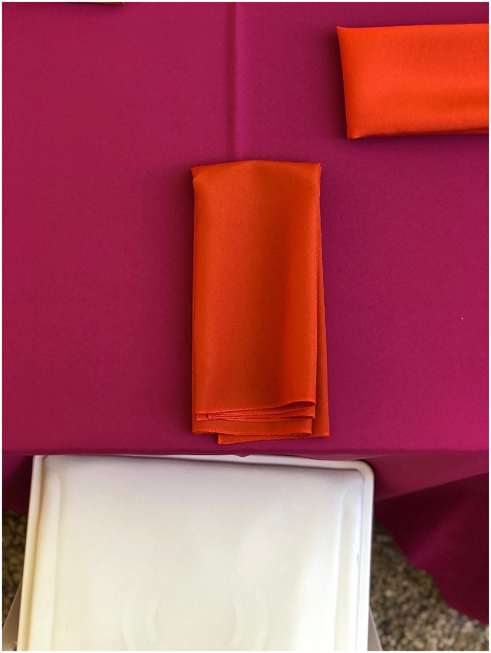
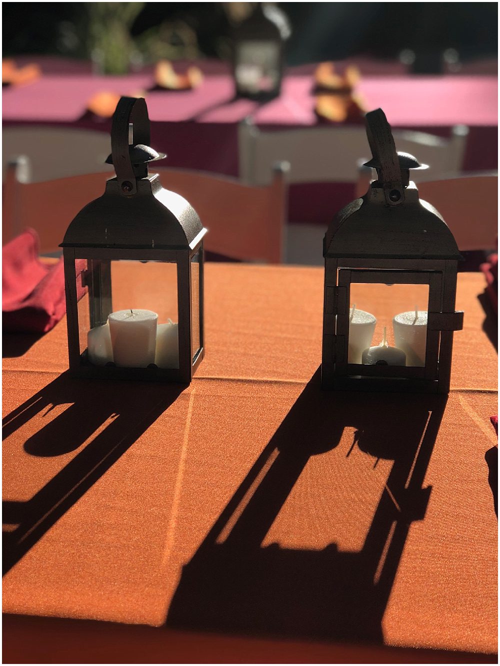
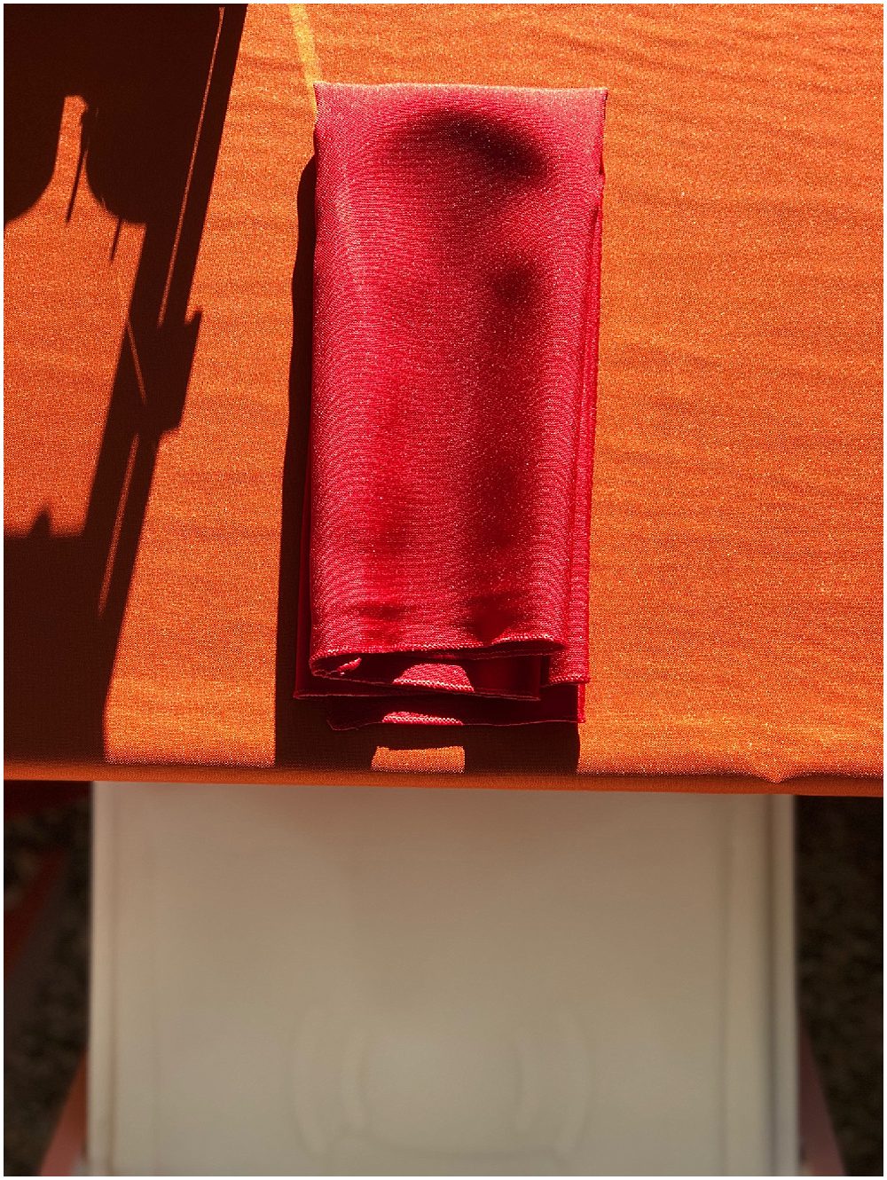
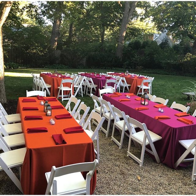
We set up dinner tables for guests in the backyard, choosing raspberry-red and classic orange as our palette. We love the spirited contrast of the red napkins on the orange table and the orange napkins on the red table. Because of those statement throw pillows, the backyard felt like an extension of the living room. Simple white folding chairs add a nice neutral element to the scene. Along the center of each table, we stationed a variety of candle holders for ambient lighting after dark. Once again, we wanted to utilize as much as we could from our client’s existing decor collection—the lanterns and tiny tealight holders are hers. She chose to use multiple tealights in each lantern rather than a single large votive because the shorter candles provided more light.
Food and Drink
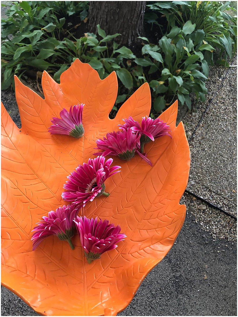
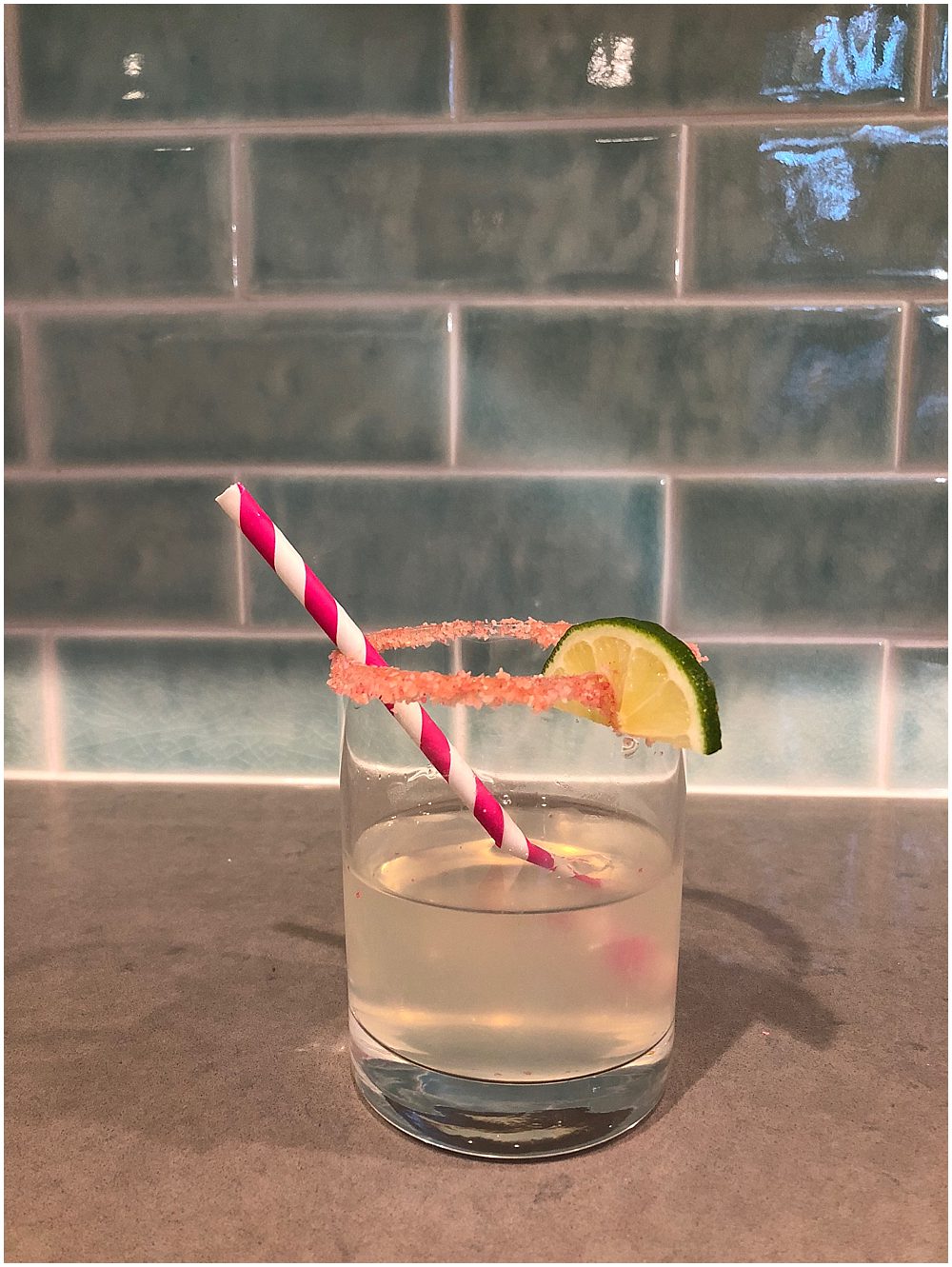
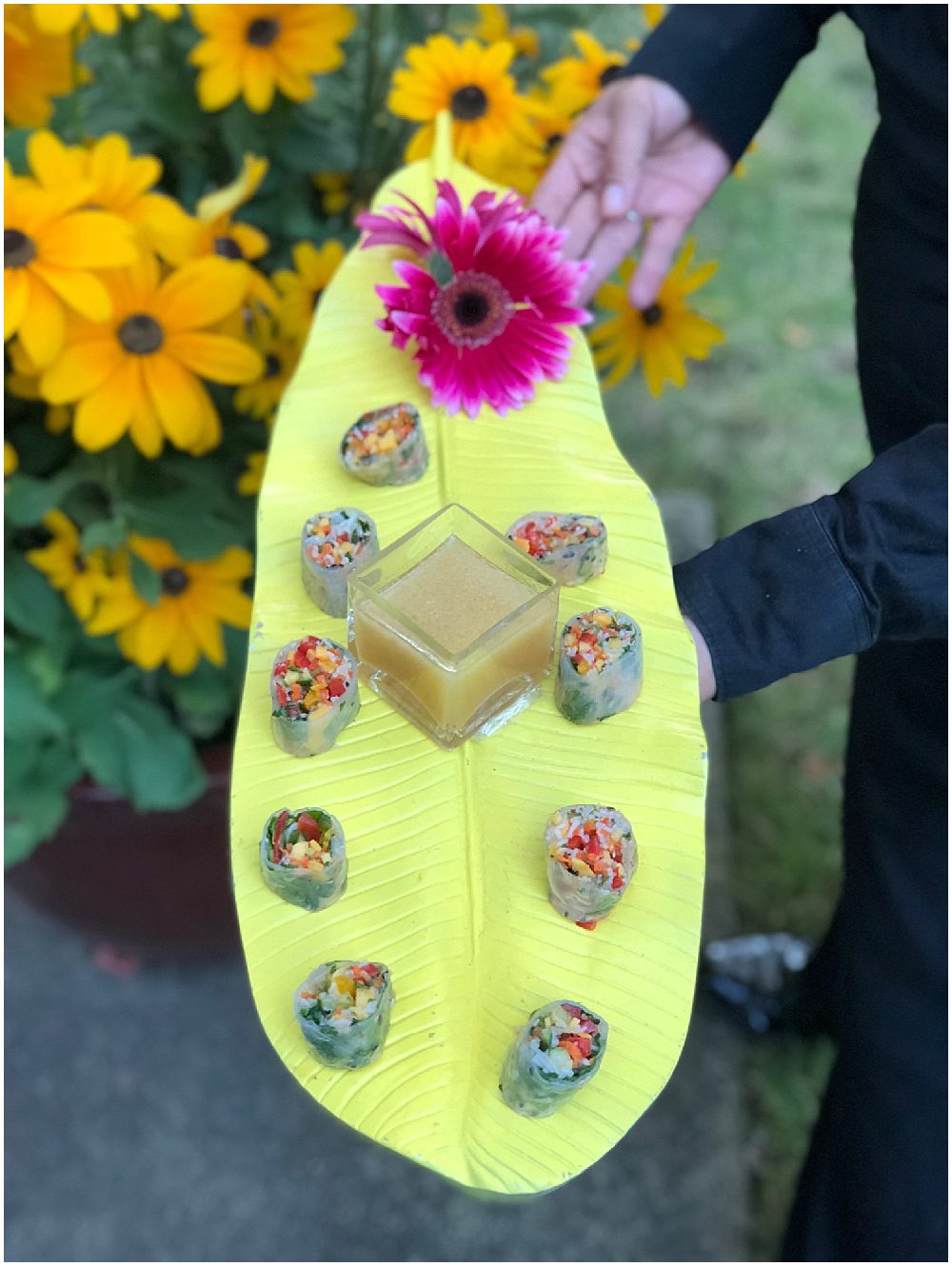
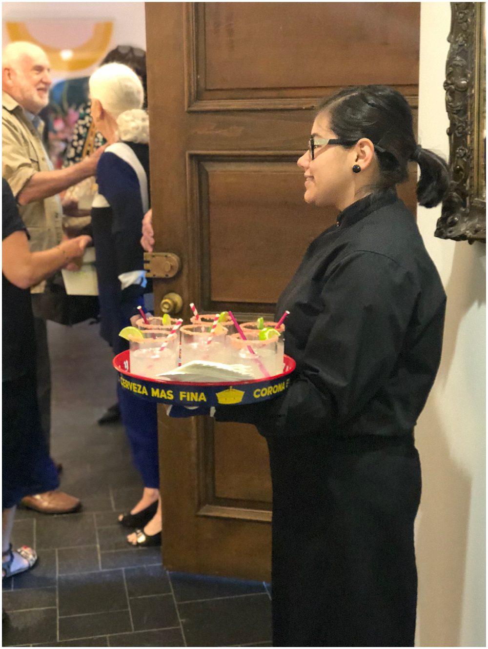
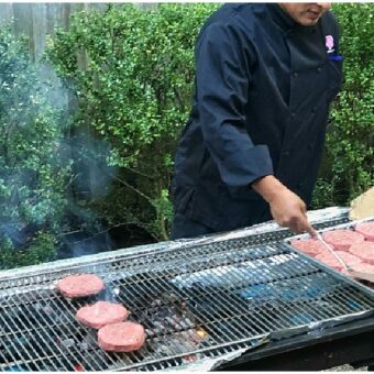
With our vibrant Pantone 2019 palette, we couldn’t just serve our hors d’oeuvres on plain old passing trays. Instead, Kenny chose brightly-colored lacquer serving trays shaped into large leaves. On our beverage passing trays, the color comes in the form of pink-salt-rimmed margaritas with pink-striped paper drinking straws. The striped straws also brightened up our self-serve drinks station featuring galvanized ice buckets. We followed a “summertime bbq” theme for our food service. Hors d’oeuvres included sundried tomato deviled eggs and mango salad rolls, and dinner (of course) included beef burgers and hot dogs, all grilled on the side of the house.
Party On!
The finished look of our party was so Pantone 2019 and exactly in line with the client’s home decor. With colors like these on the horizon, we think the future of design looks bright!

Related Posts
-
BBQ-Style Backyard Catering for Memorial Day
May 9, 2019 -
An Intimate Fall Beach Wedding in Chicago
September 27, 2018 -
Garden Brunch
April 16, 2013 -

A Michigan Harbor County “Napa” Dinner
April 16, 2013